As I said in my earlier post, this series is about creating a real world site with Orchard CMS, I’m not covering using Orchard to manage the site, just the technical development parts. All of the code is available on codeplex here : http://orchardsamplesite.codeplex.com/
Preamble
I’ve had to slow down on the posts this last week as I’m coming to the end of a re-architecture project for a UK retailer, so it’s been a bit hectic working late nights with no time to write, but to re-cap, so far in the last 5 parts, we’ve got a theme up and running, tidied it up a bit, created a dummy twitter widget and then in the last part, we made the twitter widget functional. I’ve been encouraged by the sudden leap in visitors to this blog since I started the Orchard series, so just wanted to say thanks for visiting and for the encouraging feedback I’ve received, makes me want to get more out there and make my own small contribution to building the community.
So, getting to the point for today - In this post we’re going to look at composing our own content types from existing modules. Orchard, rather than just defining content types as a set of properties, allows you to compose your content from various content parts. This is a pretty neat concept as you can easily define say an event content part and then attach it to any content item on your site, effectively allowing anything on the site to become an event.
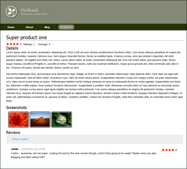
For our purposes, we’re going to compose some content types from the common, orchard-in-built parts along with some parts and functionality exposed from Contrib.Voting, Contrib.Reviews and the Mello image gallery. We’ll also build a custom part which will allow us to provide simple synopsis information for when the product is rendered in a list and we’ll compose two content types – ProductList and Product, which will make up the concept of a product catalogue on our site. Our finished result should be as follows;
The listing page;
One of the product pages
Take note of some of the complexity here – we not only have the details of the product, but we’ve got some really rich functionality around ratings, feedback reviews, and screenshots presented in a nice way, and the best part is we don’t have to write any code to get this stuff! (well, apart from a migration and updating some theme templates). You’ll notice in the product page screenshot above, that we have some widgets to the right with TODO in them - we’ll be building on what we create today in future posts to provide navigation to product specific content (basically sub-level navigation being fed by the in-built menu/navigation tool), and to allow you to add the product to a shopping basket or register your interest if it’s pre-release, and finally, to automatically find and aggregate any content related to the product.
Getting the modules
If you aren’t working from the source code on codeplex, then you’ll need to use the gallery to get the latest modules for Contrib.Voting, Contrib.Reviews and the Mello image gallery. You can do this in a number of ways, but the easiest is probably through the Modules option in admin and go to the gallery tab to find the modules. From there, you can simply click install to get the module in question.
Defining a migration
In order to get our new content types defined, we need to tell orchard about the content types and which content parts are composed together to make those types up. So, in the SampleSiteModule project, create a new “Migration-ProductTypes.cs” file as follows;
using Orchard.ContentManagement.MetaData;
using Orchard.Core.Contents.Extensions;
using Orchard.Data.Migration;

namespace SampleSiteModule
{
    public class MigrationsProductTypes : DataMigrationImpl
    {
        public int Create()
        {
            // Define the product list type which will
            // contain body details, common, route, menu and be a container
            ContentDefinitionManager.AlterTypeDefinition("ProductList",
                cfg => cfg
                    .WithPart("BodyPart")
                    .WithPart("CommonPart")
                    .WithPart("RoutePart")
                    .WithPart("MenuPart")
                    .WithPart("ContainerPart")
                    .Creatable());

            // Define the product type which will
            // contain body details, common, route, be containable and have
            // the reviews and image gallery parts.
            ContentDefinitionManager.AlterTypeDefinition("Product",
                cfg => cfg
                    .WithPart("BodyPart")
                    .WithPart("CommonPart")
                    .WithPart("RoutePart")
                    .WithPart("ContainablePart")
                    .WithPart("ReviewsPart")
                    .WithPart("ImageGalleryPart")
                    .Creatable());

            return 1;
        }
    }
}
As I’m sure you already know, a migration is any class that inherits DataMigrationImpl and offers at least a Create method. That create method will be invoked whenever your feature is enabled for the first time – subsequent activations will only run any methods named UpdateFromX() if the current version already installed is represented by an UpdateFromX() method in your migration.
In our code, we’re quite simply telling the content definition manager of the existence of two new types – ProductList and Product.
ProductList is composed from the BodyPart (which gives us the usual html body content), the CommonPart, the RoutePart (to allow items of this type to have a url), the MenuPart (to allow items to appear on the menu) and the ContainerPart (instructing orchard that this type will contain other items).
The Product part follows the same structure, but we have ContainablePart instead of ContainerPart and we’ve also added the ReviewsPart and ImageGalleryPart which brings in the reviews functionality and the image gallery.
Modify the module.txt file
Next, we need to update our module.txt file as follows;
Name: Product Types
Category: Sample Site
Description: Content types for product list and main product page
Dependencies: Contrib.Reviews, Mello.ImageGallery
AntiForgery: enabled
Author: Tony Johnson
Website: http://www.deepcode.co.uk
Version: 1.0
OrchardVersion: 1.1
Features:
    TwitterWidget:
        Name: Twitter Widget
        Category: Sample Site
        Description: Widget for latest tweets
I decided that the main feature of this module should be the definition of these types. The other features we’re building are complimentary to the rest of the site, and something has to be the main feature. Notice the dependencies introduced which means this module can’t be enabled unless it can find the Reviews and ImageGallery parts, however it will automatically enable them if they are present and so, after you’ve built your module, in the modules admin tool you should now be able to enable the “Product Types” feature;
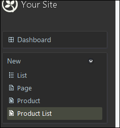
After enabling, you should then find options to create a new product list and product on the new menu;
Go ahead and create a new product list with a route url of /products (this will become important later when we set up some widget layers) and create a couple of products to go with it. You’ll need to create a new image gallery with some images in it in order to get the screenshot images into a product page. Note, when creating your pages, it’s a good idea to make the url /products/product-name as this will make the widget layers easier later.
Once you’ve created some content, if you navigate to your new product list page you should have something like this;
Default part rendering
How quick was that! As you can see, we haven’t defined any templates yet so the default templates for the various parts that make up our types are kicking in. This is great out of the box, but it’s not quite how we want it – on the product list page we don’t want screenshots or the date/time meta data, we want our heading a little more consistent and we want to show more of the body text, then on the product page itself we want to move some of the parts around a little so they are more like what we have in the original screenshots. We’ll sort this out in our theme in a second, but first – the synopsis idea.
At the moment, the list view is rendering an extracted synopsis of the product from the main body content. Whilst that might be just what you’re looking for on your site, in our case we want to be able to provide a more condensed and meaningful synopsis text to appear here instead of the body content, so before we think about skinning this we’ll look at building a custom content part that will allow us to attach synopsis text and an optional thumbnail image to content types – when we sort the theme out later, we’ll change the rendering of the list view to only show the synopsis part, the title/link and the current review rating so it will look like this;
Synopsis part
Creating the synopsis part is quite straight forward, but involves quite a few steps. Just like when we created the twitter widget (the widget configuration is a part) we need to create a content part record which will describe the persistence, a content part which will wrap the record, a handler, a driver to build the shapes, a couple of templates – one for how to edit the content and one for the default rendering and create a migration. We’ll also need to update placement.info and module.txt for our module to describe where to put the various bits and tell orchard about the feature.
Lets crack on….
Create the record and part
In the model directory, create the following two files (should be self explanatory if you’ve read previous posts).
SynopsisRecord.cs
using Orchard.ContentManagement.Records;
using Orchard.Environment.Extensions;

namespace SampleSiteModule.Models
{
    [OrchardFeature("Synopsis")]
    public class SynopsisRecord : ContentPartRecord
    {
        public virtual string SynopsisText { get; set; }
        public virtual string ThumbnailUrl { get; set; }
    }
}
SynopsisPart.cs
using Orchard.ContentManagement;
using Orchard.Environment.Extensions;

namespace SampleSiteModule.Models
{
    [OrchardFeature("Synopsis")]
    public class SynopsisPart : ContentPart<SynopsisRecord>
    {
        public string Synopsis
        {
            get { return Record.SynopsisText; }
            set { Record.SynopsisText = value; }
        }

        public string ThumbnailUrl
        {
            get { return Record.ThumbnailUrl; }
            set { Record.ThumbnailUrl = value; }
        }
    }
}
Create the handler
In the handlers folder create SynopsisHandler.cs;
using Orchard.ContentManagement.Handlers;
using Orchard.Data;
using Orchard.Environment.Extensions;
using SampleSiteModule.Models;

namespace SampleSiteModule.Handlers
{
    [OrchardFeature("Synopsis")]
    public class SynopsisHandler : ContentHandler
    {
        public SynopsisHandler(IRepository<SynopsisRecord> repository)
        {
            Filters.Add(StorageFilter.For(repository));
        }
    }
}
Create the driver
And in the drivers folder create SynopsisDriver.cs;
using Orchard.ContentManagement;
using Orchard.ContentManagement.Drivers;
using Orchard.Environment.Extensions;
using SampleSiteModule.Models;

namespace SampleSiteModule.Drivers
{
    [OrchardFeature("Synopsis")]
    public class SynopsisDriver : ContentPartDriver<SynopsisPart>
    {
        protected override DriverResult Display(SynopsisPart part, string displayType, dynamic shapeHelper)
        {
            return ContentShape("Parts_Synopsis",
                () => shapeHelper.Parts_Synopsis(
                        Synopsis : part.Synopsis,
                        Thumbnail : part.ThumbnailUrl ));
        }

        protected override DriverResult Editor(SynopsisPart part, dynamic shapeHelper)
        {
            return ContentShape("Parts_Synopsis_Edit",
                () => shapeHelper.EditorTemplate(
                    TemplateName: "Parts/Synopsis",
                    Model: part,
                    Prefix: Prefix));
        }

        protected override DriverResult Editor(SynopsisPart part, IUpdateModel updater, dynamic shapeHelper)
        {
            updater.TryUpdateModel(part, Prefix, null, null);
            return Editor(part, shapeHelper);
        }
    }
}
Just a very quick refresher – the Display and Editor methods are called to build shapes that will be used when rendering this shape on the site and in the admin tool. In the case of the display method we’re creating a custom shape that gets added to the shape tree called Parts_Synopsis with properties for Synopsis and Thumbnail taken from the content part that orchard is presenting (as such a shape doesn’t necessarily have to reflect it’s underlying content part, we can add whatever we want into the properties of the shape).
Define a migration.
In the root of the module, create a file named "Migration-Synopsis.cs”, this should be second nature now:
using System.Data;
using Orchard.ContentManagement.MetaData;
using Orchard.Core.Contents.Extensions;
using Orchard.Data.Migration;
using Orchard.Environment.Extensions;
using SampleSiteModule.Models;

namespace SampleSiteModule
{
    [OrchardFeature("Synopsis")]
    public class MigrationsSynopsis : DataMigrationImpl
    {
        public int Create()
        {
            SchemaBuilder.CreateTable("SynopsisRecord",
                table => table
                    .ContentPartRecord()
                    .Column("SynopsisText", DbType.String, c => c.Unlimited())
                    .Column("ThumbnailUrl", DbType.String));

            // Tell the content def manager that our part is attachable
            ContentDefinitionManager.AlterPartDefinition(typeof(SynopsisPart).Name,
                builder => builder.Attachable());

            return 1;
        }
    }
}
Define the editor template
Create the following view in Views/EditorTemplates/Parts/Synopsis.cshtml;
@model SampleSiteModule.Models.SynopsisPart

<fieldset>
    <legend>Synopsis</legend>

    <div class="editor-label">@T("Synopsis"):</div>
    <div class="editor-field">
        @Html.TextAreaFor(m => m.Synopsis)
        @Html.ValidationMessageFor(m => m.Synopsis)
    </div>

    <div class="editor-label">@T("Thumbnail"):</div>
    <div class="editor-field">
        @Html.TextBoxFor( m => m.ThumbnailUrl )
        @Html.ValidationMessageFor( m => m.ThumbnailUrl )
    </div>
</fieldset>
Notice at the moment I’ve just thrown a textbox on there for the thumbnail – ideally I’d like this to select something in the media manager, but haven’t quite worked out how to do that yet. I’ll post something on this when I’ve worked out how to go about it.
Define the view template
And this view will be the default mechanism for rendering this part on a page – create Views/Parts/Synopsis.cshtml;
@using Orchard.Core.Routable.Models
@using Orchard.ContentManagement.ViewModels
@using Orchard.ContentManagement
@using Orchard.Core.Common.Models
@using SampleSiteModule.Models

@{
    Style.Require("Synopsis");
    var synopsisText = (Model.Synopsis.ToString()).Replace("\n", "</p><p>");
    var thumbnailUrl = Model.Thumbnail == null ? "" : Model.Thumbnail;
}

@if (String.IsNullOrEmpty(thumbnailUrl))
{
    <div>
        <p>@Html.Raw(synopsisText)</p>
    </div>
}
else
{
    <div class="synopsis-container">
        <div class="synopsis-text">
            <p>@Html.Raw(synopsisText)</p>
        </div>
    </div>
    <div class="synopsis-thumbnail">
        <img src="@thumbnailUrl" width="150" height="150"/>
    </div>
    <div class="synopsis-clear"></div>
}
Create the resource manifest provider
You will notice that, in the view template, we have a Style.Require(“synopsis”) call in this template but we don’t have a stylesheet and how does the Style.Require work out where the actual CSS file is anyway? This is where a resource manifest provider comes in, which tells orchard how to resolve a Style.Require (or a Script.Require for that matter) and ensure it only gets included once. If the resource exists in the theme, the resource will be resolved from there first I believe (I did check, but it was a couple of weeks ago now and I’ve slept since then), but otherwise it will use the resource provided by the manifest provider.
Create a ResourceManifest.cs file in the root of the module project;
using Orchard.UI.Resources;

namespace SampleSiteModule
{
    /// <summary>
    /// Defines common resources for this module.
    /// </summary>
    public class ResourceManifest : IResourceManifestProvider
    {
        public void BuildManifests(ResourceManifestBuilder builder)
        {
            builder.Add().DefineStyle("Synopsis").SetUrl("synopsis.css");
        }
    }
}
Create the stylesheet
So now we have a resource manifest telling us where the resource is and we are using it in the view template, we’d better make it available. Create synopsis.css in the Styles folder;
DIV.synopsis-container
{
    float: left;
    width: 100%;
}
DIV.synopsis-text
{
    margin-left: 160px;
}
DIV.synopsis-thumbnail
{
    float: left;
    width: 150px;
    margin-left: -100%;
}
DIV.synopsis-clear
{
    content: ".";
    display: block;
    height: 0px;
    clear: both;
    visibility: hidden;
}
Update the placement.info file
We’re almost there – if we don’t tell orchard where to put our new parts by default, they won’t appear. Modify the placement.info file to add the highlighted lines;
<Placement>
    <Place Parts_TwitterWidget="Content:1"/>
    <Place Parts_TwitterWidget_Edit="Content:7.5"/>

  <!-- Synopsis -->
  <!-- Note the summary view is the only display mode... -->
  <Match DisplayType="Summary">
    <Place Parts_Synopsis="Content:10"/>
  </Match>
  <Place Parts_Synopsis_Edit="Content:8"/>
</Placement>
A quick word of explanation… We don’t actually want our synopsis part to appear anywhere other than on the listing screen. When orchard renders parts into the listing it sets the display type to summary and we can specify which display type we’re interested in within the placement.info file. In the above I’m saying that the Parts_Synopsis shape should be put into the content local zone at position 10, but only if the display type is summary. Clear as mud?
Update the module.txt file to expose our new synopsis feature
Finally to get this content part available, we need to tell orchard about it. Update module.txt as follows;
Name: Product Types
Category: Sample Site
Description: Content types for product list and main product page
Dependencies: Contrib.Reviews, Mello.ImageGallery
AntiForgery: enabled
Author: Tony Johnson
Website: http://www.deepcode.co.uk
Version: 1.0
OrchardVersion: 1.1
Features:
    TwitterWidget:
        Name: Twitter Widget
        Category: Sample Site
        Description: Widget for latest tweets
    Synopsis:
        Name: Synopsis
        Category: Sample Site
        Description: Allows synopsis to be added to types
Attach the synopsis to our product type in it’s migration
Ok, so that was all the plumbing for our new content part done, let’s go ahead and update the product types migration to include the synopsis on our product. Add the following method to Migration-ProductTypes.cs;
       public int UpdateFrom1()
        {
            ContentDefinitionManager.AlterTypeDefinition("Product",
                cfg => cfg.WithPart("SynopsisPart"));

            return 2;
        }
Go forth and view the beauty of your creation
Build, activate the synopsis feature and update the product types feature from the admin tool and when done, go ahead and fill in the synopsis fields of your already created products.
Check out my rendering
Er, yeah, this isn’t pretty is it! The synopsis data doesn’t appear in the main product pages, by design (see placement.info above), but the summary view is now horrendous, let’s try and sort all this out by updating our theme to render everything exactly where we want it and how we want it;
Tidying up the product listing using our theme’s placement.info
Interestingly enough, the largest part of the tidy up for the product listing is as easy as manipulating the placement.info file in our theme project. Update placement.info to add the highlighted lines below;
<Placement>
    <!-- Remove the page title from the homepage -->
    <Match Path="~/">
        <Place Parts_RoutableTitle="-"/>
    </Match>

    <!-- Remove metadata part from all pages and from blogs -->
    <Match ContentType="Page">
        <Place Parts_Common_Metadata="-"/>
    </Match>
    <Match ContentType="Blog">
        <Place Parts_Common_Metadata="-"/>
    </Match>

    <!-- Remove comment counts from blog posts and set the summary blog post body alternate -->
    <Match ContentType="BlogPost">
        <Place Parts_Comments_Count="-"/>
        <Match DisplayType="Summary">
            <Place Parts_Common_Body_Summary="Content:5;Alternate=Parts_BlogPostSummaryBody"/>
        </Match>
    </Match>

  <Match ContentType="Product">
    <!-- In summary view, remove the body summary (we will replace with synopsis),
            the meta data and the image gallery thumbnails -->
    <Match DisplayType="Summary">
      <Place Parts_Common_Body_Summary="-"/>
      <Place Parts_Common_Metadata_Summary="-"/>
      <Place Parts_ImageGallery="-"/>
    </Match>

    <!-- In detail view, remove the meda data, move the stars for ratings to the top
             put the image gallery below the content and define alternate wrappers for
             the image gallery and the body text -->
    <Match DisplayType="Detail">
      <Place Parts_Common_Metadata="-"/>
      <Place Parts_Stars_Details="Content:0"/>
      <Place Parts_ImageGallery="Content:2;Wrapper=Product_ImageGalleryWrapper"/>
      <Place Parts_Common_Body="Content:1;Wrapper=Product_BodyTextWrapper"/>
    </Match>
  </Match>
</Placement>
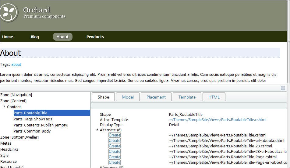
First off, we’re telling placement.info to work on the Product content type, then we have separate rules for when we’re showing a product in summary view and detail view. Concentrating on the summary view first, all we need to do is remove the Parts_Common_Body_Summary, Parts_Common_Metadata_Summary and Parts_ImageGallery shapes from the rendering to get the layout we’re interested in - you can find the names of shapes easily using the orchard shape tracing feature (yet more bowing to Sébastien Ros for this feature! , followed by mass apologies to everyone for the lame emoticon – please don’t leave!)
Ok, so, that gives us just our title, rating and synopsis parts rendering as desired;
Hmmm, not quite – the title/link isn’t quite right …
Changing how the routable title is rendered in summary form.
We want our routable title to be a H4 as opposed to the H1 it is at the moment. The shape we’re interested in is Parts_RoutableTitle so we can create a new razor template in our theme’s Views folder called Parts.RoutableTitle.Summary.cshml (again you can find the template names that can be used to provide alternate shape rendering by using shape tracing). This template will be used whenever the RoutableTitle part is rendered in summary view;
@* This overrides how a routable title part is rendered in summary form *@

@using Orchard.ContentManagement
@{
    ContentItem contentItem = Model.ContentPart.ContentItem;
    string title = Model.Title.ToString();
}

<h4>@Html.ItemDisplayLink(title, contentItem)</h4>
And now our product list is just right…..
Reordering parts on the main product page and specifying alternates directly
So our product page now needs a bit of alternate/re-ordering love – this is what we have at the moment;
and this is what we’re aiming for;
Yes, the changes are subtle, but they are;
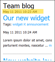
- Removed meta data (published date) from the top
- Added a “Details” title to the main body content
- Moved screenshots to be above reviews
- Added a “Screenshots” title to the screenshots section
Earlier, we changed the theme’s placement.info file to include the following;
    <Match DisplayType="Detail">
      <Place Parts_Common_Metadata="-"/>
      <Place Parts_Stars_Details="Content:0"/>
      <Place Parts_ImageGallery="Content:2;Wrapper=Product_ImageGalleryWrapper"/>
      <Place Parts_Common_Body="Content:1;Wrapper=Product_BodyTextWrapper"/>
    </Match>
You can probably guess what’s going on here, but first off, when we render this product in Detail mode, we get rid of the metadata shape. We then ensure that the Parts_Stars_Details part is right at the top of the local zone, move Parts_ImageGallery to position 2 and Parts_Common_Body to position 1, we also specify wrappers for the image gallery and body parts! In earlier posts we specified alternates directly in the placement.info file, and specifying wrappers is a similar concept. It allows you to define a shape that will be rendered around the target shape.
By specifying Product_ImageGalleryWrapper and Product_BodyTextWrapper, we can now create templates that will be used to wrap the target parts by naming them Product.ImageGalleryWrapper.cshtml and Product.BodyTextWrapper.cshtml respectively (in our template project’s views folder);
Product.ImageGalleryWrapper.cshtml
@using Orchard.ContentManagement;
@using Orchard.Widgets.Models;

<div>
    <h4>@T("Screenshots")</h4>
    @Display(Model.Metadata.ChildContent)
</div>
Product.BodyTextWrapper.cshtml
@using Orchard.ContentManagement;
@using Orchard.Widgets.Models;

<div>
    <h4>@T("Details")</h4>
    @Display(Model.Metadata.ChildContent)
</div>
That’s all folks
And we’re done! If all that sounded like a lot of stuff, it was, but we’ve achieved a great deal! I hope you find this useful, next up (hopefully next week):
- Creating sub-navigation
- Creating a widget that will allow navigation within sections of your site
- Relating content
- Creating a widget to find content on your site that may be related to the current content being viewed.
- Basic shopping, advanced widgets and controller based content
- This will be a multi-part post I think covering implementing basic shopping basket functionality
- Creating a widget that renders initially as part of the normal rendering pipe and then updates with AJAX calls to a custom controller.
- Implementing a custom controller to provide complete rendering control – to display our shopping basket – yet keeping the rendering themeable.
As ever, grab the code from codeplex: http://orchardsamplesite.codeplex.com under the part-06 folder (or just skip ahead to final, which is evolving quicker than the blog posts are!).


