Tuesday, 17 May 2011

Real world Orchard CMS – part 4 – cleaning up the theme

As I said in my earlier post, this series is about creating a real world site with Orchard CMS, I’m not covering using Orchard to manage the site, just the technical development parts. All of the code is available on codeplex here : http://orchardsamplesite.codeplex.com/

Preamble

In the earlier parts of this series we created a basic theme, and a widget that will display latest twitter feeds (actually, that widget just displays canned results but if you look in the “final” directory in the source, you’ll find the finished working version of this widget). In this post I want to look at enhancing the theme somewhat as there are a few subtleties at the moment that aren’t right with how we want this theme to function.

If you’re following along, by now you should have added some content to your site, on the home page you should have;

  • A html widget that shows the featured product content (just mocked up at the moment)
  • A html widget with some “about us” content in the left hand column
  • The twitter widget in the left hand column
  • A blog created with a couple of dummy posts
  • A recent blog posts widget in the centre column
  • An additional html widget with some “support” content in the right hand column.

Like this;

image

But this isn’t quite how we want it. It should look more like this;

image

So there are 5 key things we need to sort out;

  • Page titles
    • Getting rid of it on the homepage
    • Restyling it everywhere else
    • Removing the publishing metadata (date) on pages
  • Using a filter provider to indicate we’re rendering the homepage
    • To make some discreet changes in the main layout template without having a separate template just for the homepage.
  • Making the widget titles stand out more (I believe this is what they call “making it pop” <<snigger>>)
  • Reformatting the recent blog posts widget on the homepage
  • Improving our main blog page to show full articles

Part 4.1 – sorting out page titles

Page titles in the theme at the moment serve their purpose, but they aren’t quite right for us in a number of ways. These are;

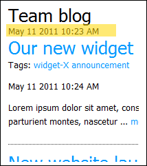
  • They show publish date/time with every page title, which on the blog list page can be a little cumbersome in particular.
    image
  • We don’t want the page title on the homepage at all, it’s a little ungainly.
  • We want them to “pop” more ;)

What we want to achieve is to change the way page titles are displayed from this, as the theme is presently configured;

image

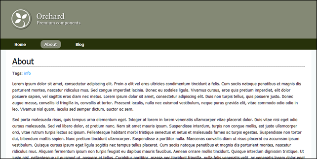
to this… yes, I know, it’s only a subtle change, but <sarcasm>it “pops” now don’t you think</sarcasm>

image 

The first thing we want to look at is placement.info – placement.info is the theme writers friend, I suggest you go off an read about it in the documentation, but suffice it to say it allows you to send shapes you don’t want to oblivion or to provide alternate templates (or wrappers) in certain conditions. You can specify criteria, such as on a particular page, when rendering a particular content type, I want to hide the metadata shape, or I want to render it with an alternative template name and so on. We’re going to use placement.info to get rid of the title and metadata on the homepage and get rid of the metadata on other pages.

In your theme project, create a file named “Placement.info” in the root of the project, and fill it thus;

   1:  <Placement>
   2:      <!-- Remove the page title from the homepage -->
   3:      <Match Path="~/">
   4:          <Place Parts_RoutableTitle="-"/>
   5:      </Match>
   6:   
   7:      <!-- Remove metadata part from all pages and from blogs -->
   8:      <Match ContentType="Page">
   9:          <Place Parts_Common_Metadata="-"/>
  10:      </Match>
  11:      <Match ContentType="Blog">
  12:          <Place Parts_Common_Metadata="-"/>
  13:      </Match>
  14:  </Placement>

Lines 3,4,5 create a rule that whenever the homepage is being rendered, it should take the shape named Parts_RoutableTitle and send it to a local zone named “-“. This zone doesn’t exist, it’s used to send the shape rendering to purgatory. The routable title shape usually includes the metadata shape also (Parts_Common_Metadata – the shape with the published date/time on it), so by removing the entire title shape we also get rid of the metadata on the homepage.

Lines 7-10 remove the Parts_Common_Metadata shape from any page that is rendered. A page is of course a content type, and the match rule reflects this.

Similarly on lines 11-13 we tell orchard to remove the metadata shape from the blog list pages. Note this is not the blog post pages, where we want to keep that meta data to show when the post was published, blog post pages have a content type of BlogPost, so these lines will only affect the overall blog listing page.

So that part was simple enough, we’ve removed the bits we don’t want, so we now need to reformat the bits we wanted to change; Before we go on, ensure you understand the following bits of the orchard documentation, which explain things more clearly than I can;

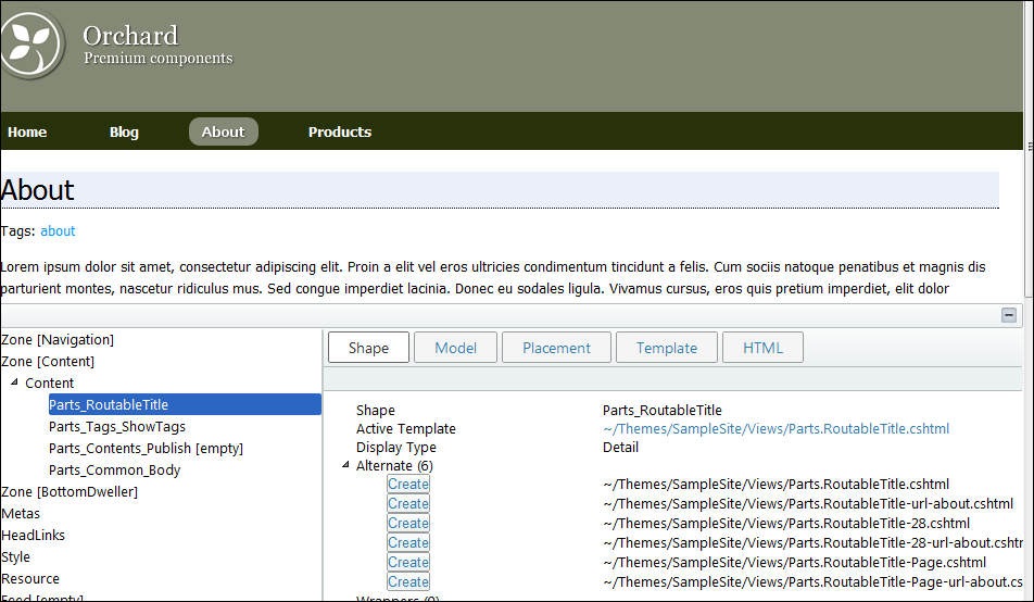
In summary, a shape which is added to the pipeline for rendering will have a bunch of templates that you could override to change how it will be rendered. For instance, to change a page title with a shape name of Parts_RoutableTitle, you could just create a new razor file in your template’s view folder called Parts.RoutableTitle.cshtml and this will change every page title throughout your site. Alternates are also available, so you could create Parts.RoutableTitle-Page.cshtml and this will be the template used whenever the Parts_RoutableTitle shape is rendered within a content type of Page. For a full list of alternates, use the shape tracing feature of orchard 1.1 (and enable the url alternates feature for more alternates out of the box);
image

So, because we want to change the title on every page (except the homepage where we’ve removed it), we can just create Parts.RoutableTitle.cshtml in our views folder as follows;

<h1 class="page-title">@Model.Title</h1>

That’s all – if you’re wondering how to know the “Title” property is available on this dynamic, again, take a close look at the shape tracing feature, specifically the model tab (Anyone else want to send free beer to whomever wrote this little nugget of gold???)

All we then need is the H1.page-title class in our stylesheet;

h1.page-title{ font-size: 2em; border-bottom: 1px dotted black; margin-bottom: 8pt; padding-bottom: 2px; }

We should now be in a position where the title and metadata is removed from the homepage, the metadata is removed from the pages we don’t want it and our titles “pop”. Let’s go back to the homepage.

Part 4.2 closing the gaps on the homepage with a filter provider

Notice that between the promo content and the widget areas there is still some blank content. In fact if you inspect the rendered source you will find this;

<div id="layout-body" class="zone">    
    <div id="zone-body" class="without-sidebar">
        <div class="zone zone-content">
            <article class="content-item page">
                <header>
                </header>
            </article>
        </div>
    </div>
</div>

Which, in our layout.cshtml corresponds to;

@if (displayContent || displayBodySideBar)
{
    <div id="layout-body" class="zone">    
        <div id="zone-body" class="@bodyClasses">
            @Display(Model.Content)
        </div>

        @if (displayBodySideBar)
        {
            <div id="zone-body-sidebar">
            @Display(Model.BodySideBar)
            </div>
        }
    </div>     
}

Hmmm – so our Model.content is empty (so displayContent should have been false) but it’s clearly not null, so it’s rendering this whole section which we don’t really want if we’re on the homepage and I want that gap closed. I could create a separate layout for the homepage using url alternates, but to be honest this is so trivial I’d sooner just be able to check in the template code if this is the homepage and if so, don’t display the entire body content section, even if there IS content in there. We can use a FilterProvider for just this purpose;

Create a class file in your theme called LayoutFilter.cs with the following code;

using System.Web.Mvc;
using Orchard;
using Orchard.Mvc.Filters;

namespace SampleSite
{
    /// <summary>
    /// This filter just adds an IsHomepage flag to the Layout shape if the page
    /// being rendered is the homepage. We check this in the layout to determine
    /// whether to render the content area or not (this theme is used to just render
    /// widgets in zones on the homepage)
    /// </summary>
    public class HomepageLayoutFilter : FilterProvider, IResultFilter
    {
        private readonly IWorkContextAccessor _wca;

        public HomepageLayoutFilter(IWorkContextAccessor wca)
        {
            _wca = wca;
        }

        public void OnResultExecuting(ResultExecutingContext filterContext)
        {
            var workContext = _wca.GetContext();
            var routeValues = filterContext.RouteData.Values;

            if (((string)routeValues["area"]) == "HomePage")
                workContext.Layout.IsHomepage = true;
        }

        public void OnResultExecuted(ResultExecutedContext filterContext)
        {
        }
    }
}

This filter gets discovered automatically and called when a page render is executing. It gets an IWorkContextAccessor injected into it, which we can use to manipulate the shapes already in the shape tree. Our OnResultExecuting method gets called and we determine if the MVC area we are in is for the HomePage and if it is, we inject a property into the Layout shape that flags that this is the homepage. We then just need to take that into account in our layout.cshtml by changing this line;

var displayContent = (Model.Content != null);

to this;

var displayContent = !(WorkContext.Layout.IsHomepage == true);

Now when the homepage is rendered, that slightly annoying gap should close without having to create a whole separate template.

Part 4.3 – adding more distinction to the titles of widgets

Presently the widget titles on the homepage (and the rest of the site) look a little lost in the overall design – they look a little anaemic don’t you think;

image

We want them to look more like this;

image

Which is extremely simple, we just override the wrapper markup for widgets by creating “Widget.Wrapper.cshtml” in our views folder with the following code;

@* This overrides the default widget wrapper *@
@using Orchard.ContentManagement;
@using Orchard.Widgets.Models;
@{
    var title = ((IContent)Model.ContentItem).As<WidgetPart>().Title;
    var tag = Tag(Model, "article");
}
@tag.StartElement
    @if (HasText(title) || Model.Header != null)
    {
    <header>
        @if (HasText(title))
        {
        <h1 class="widget-title">@title</h1>
        }
        @Display(Model.Header)
    </header>
    }
    @Display(Model.Child)
    @if (Model.Footer != null)
    {
    <footer>
        @Display(Model.Footer)
    </footer>
    }
@tag.EndElement

This is very similar to the default widget wrapper, except we’re using H1 for the title with a CSS class of widget-title, we define this in our stylesheet as;

h1.widget-title{ font-size: 1.1em; font-weight: bold; border-bottom: 1px dotted black; margin-bottom: 8px; padding-bottom: 2px;}

And that gives us our new widget titles. We’ll be doing the same thing in another post later to add the twitter icon to our widget title for the twitter component (see the original mock up in the introductory post)

Part 4.4 - A less cluttered look to the recent blog post summaries

As you can see below, the amount of information we’re presenting on the homepage for a quick summary of posts is a little much;

image

We’re going to aim for something a little more succinct;

image 

Notice we’ve removed the tags, removed the comment count, make the title stand out a little more and also added who the author was. To achieve this we’re going to use the url alternates feature that can be found in the designer tools module – get it from the gallery and install it;

image

Ensure you have enabled the url alternates feature;

image

This feature provides some additional alternates for shapes based on url, we’re going to use an alternate for how to render blog post shapes, in summary form, on the home page. With this feature active, we can now create a shape template called Content-BlogPost-url-homepage.Summary.cshtml in our views folder. This rather long template name indicates that it will be called when rendering a summary display of a BlogPost content item when on the homepage url. The content of the file should be;

   1:  @*
   2:      This template changes the way blog post summaries 
   3:      are rendered on the homepage (Requires url alternates feature)
   4:  *@
   5:  @using Orchard.Core.Routable.Models
   6:  @using Orchard.ContentManagement.ViewModels
   7:  @using Orchard.ContentManagement
   8:  @using Orchard.Core.Common.Models
   9:   
  10:  @{
  11:      ContentItem item = Model.ContentItem;
  12:      RoutePart rpItem = item.As<RoutePart>();
  13:      BodyPart bpItem = item.As<BodyPart>();
  14:      
  15:      string linkUrl = Url.ItemDisplayUrl(item);
  16:  }
  17:   
  18:  <h4><a href="@linkUrl">@rpItem.Title</a></h4>
  19:  <div class="publishinfo">@Model.ContentItem.CommonPart.PublishedUtc by @Model.ContentItem.CommonPart.Owner.UserName</div>
  20:  <div>
  21:      <p>@Html.Raw(Html.Excerpt(bpItem.Text, 200).ToString())</p>
  22:  </div>

Nothing much to explain here,  we get the content item that is being rendered (the blog post) and get it’s Route content part and Body content part, then render it how we wanted it. EDIT: See the comment from Bertrand LeRoy on the part 3 post about working with dates.

Part 4.5 - A cleaner and fuller blog page

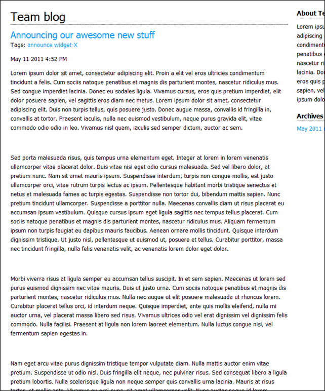
The final part of this (what has turned into a length) post is regarding the blog page. Most blogs display the full article of the most recent posts on the main blog page rather than just a summary but ours renders like this;

image

For our site, I’d sooner see the full article;
image

To achieve this, we look back to our old friend, placement.info, adding the following match rule and placements.

    <!-- Remove comment counts from blog posts and set the summary blog post body alternate -->
    <Match ContentType="BlogPost">
        <Place Parts_Comments_Count="-"/>
        <Match DisplayType="Summary">
            <Place Parts_Common_Body_Summary="Content:5;Alternate=Parts_BlogPostSummaryBody"/>
        </Match>
    </Match>

Notice we have nested match rules – the outer rule is matching against blog posts content type, the inner rule is only for when the display type for this content type is summary. We’re obviously getting rid of the comments count in general, but then in the summary rule, we’re also telling orchard to look for an alternate named Parts_BlogPostSummaryBody, which it will use when the match conditions are met and when it’s rendering a shape named Parts_Common_Body_Summary. Remember from the documentation that content is composed of multiple parts - the blog post is therefore made up of multiple parts and one of those is the body part (Parts_Common_Body), which when it’s rendered on the blog list page will render in summary form (Parts_Common_Body_Summary)….

So, this rule and placement is saying when I’m rendering a blog post and when I’m rendering it in summary form, and when the shape I’m rendering is the Parts_Common_Body_Summary shape, look for an alternate named Parts_BlogPostSummaryBody, which in turn translates to a template file of Parts.BlogPostSummaryBody.cshtml which should be in your views folder and have the following content;

@Model.Html

That’s it! Now, when your blog page renders it will show the entire blog post.

Final words

You should now have a site that looks more like our original design;

image

image

image

As a final word, forgive any inaccuracies in this series, I’m sure there will be some, I’ve only been looking at orchard now for a matter of days, I’m loving it’s flexibility and I’m sure I’ve made some mistakes along the way, but I do hope this gives you a steer in the right direction when theme-ing your sites. For the rest of the series, I’m planning on moving away from the skinning side of Orchard to look at some of the other cool things you can achieve. Don’t hold me to this, but the next parts I’m thinking will be something along the lines of;

  • Creating custom content types
    • Defining the product listing
    • Defining the product page and adding social features like voting
    • Adding screenshot library to the product page
  • Creating sub-navigation
    • Creating a widget that will allow navigation within sections of your site
  • Relating content
    • Creating a widget to find content on your site that may be related to the current content being viewed.
  • Basic shopping, advanced widgets and controller based content
    • This will be a multi-part post I think covering implementing basic shopping basket functionality
    • Creating a widget that renders initially as part of the normal rendering pipe and then updates with AJAX calls to a custom controller.
    • Implementing a custom controller to provide complete rendering control – to display our shopping basket – yet keeping the rendering themeable.

As always, the source is in the part-04 folder on code plex : http://orchardsamplesite.codeplex.com/

See you soon! Tony.

Thursday, 12 May 2011

Real world Orchard CMS – part 3 – creating the twitter widget

As I said in my earlier post, this series is about creating a real world site with Orchard CMS, I’m not covering using Orchard to manage the site, just the technical development parts. All of the code is available on codeplex here: http://orchardsamplesite.codeplex.com/

Preamble
This post is about creating a widget that will render a list of latest twitter feeds on the site. Rather than complicate matters with calling the twitter API, this post will look at building the widget itself and return canned results. Interfacing to twitter itself is left as an exercise for the reader.

Goal
To create a widget that can be added to a page that will display a list of recent tweets;

Background reading and preparation
If you are following along with the series, you should have already completed part 2 to get your theme up and running. As for background reading;

In a later article we will look at how you can build a widget without a model (content record and part), but for now, this is the standard way of constructing a widget for your site.

Lets get started - codegen the module
Open a command line and navigate to the bin directory of the site source. Here you will find orchard.exe, a command line tool for managing orchard and where we will generate our scaffolding for our custom module. Run orchard.exe. Sometimes I get an exception when I try to run the tool, if the same happens to you, just run it again and it should fire up second time round and you will be presented with the orchard shell.

Use codegen to generate the boilerplate code for your module by executing the command;

codegen module SampleSiteModule

Open the project in visual studio
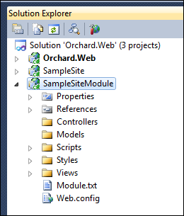
Back in visual studio you can now add the module project to the orchard solution (Right click the solution name in solution explorer and select Add –> existing project). Find the newly created module project under orchard/modules/SampleSiteModule/SampleSiteModule.csproj and select it, you should then have the module project in your solution;

image

Create the record, part, driver and handler
Our widget, when added to a page, will offer the author the ability to specify the twitter user to get tweets for, the number of tweets to obtain and a duration of time to cache the results for before hitting the twitter API again. For this we need to define the fields in a ContentRecord. Within models create a new file – TwitterWidgetRecord.cs as follows;

using Orchard.ContentManagement.Records;
using Orchard.Environment.Extensions;

namespace SampleSiteModule.Models
{
    [OrchardFeature("TwitterWidget")]
    public class TwitterWidgetRecord : ContentPartRecord
    {
        public virtual string TwitterUser { get; set; }
        public virtual int MaxPosts { get; set; }
        public virtual int CacheMinutes { get; set; }
    }
}

This simply defines the class that will represent the data to be persisted for this widget. It derives from ContentPartRecord, which in turn contains the id’s and what not’s to marry this record up to the rest of the data that composes the overall content record. Next, we need to define a ContentPart that wraps this information. Create a new file (again in models) – TwitterWidgetPart.cs;

using System.ComponentModel;
using System.ComponentModel.DataAnnotations;
using Orchard.ContentManagement;
using Orchard.Environment.Extensions;

namespace SampleSiteModule.Models
{
    [OrchardFeature("TwitterWidget")]
    public class TwitterWidgetPart : ContentPart<TwitterWidgetRecord>
    {
        [Required]
        public string TwitterUserName
        {
            get { return Record.TwitterUser; }
            set { Record.TwitterUser = value; }
        }

        [Required]
        [DefaultValue(5)]
        public int MaxPosts
        {
            get { return Record.MaxPosts; }
            set { Record.MaxPosts = value; }
        }

        [Required]
        [DefaultValue(60)]
        public int CacheMinutes
        {
            get { return Record.CacheMinutes; }
            set { Record.CacheMinutes = value; }
        }
    }
}

Next, the handler to tell orchard that we want to store the TwitterWidgetRecord to the database - create models\TwitterWidgetRecordHandler.cs;

using Orchard.ContentManagement.Handlers;
using Orchard.Data;
using Orchard.Environment.Extensions;

namespace SampleSiteModule.Models
{
    [OrchardFeature("TwitterWidget")]
    public class TwitterWidgetRecordHandler : ContentHandler
    {
        public TwitterWidgetRecordHandler(IRepository<TwitterWidgetRecord> repository)
        {
            Filters.Add(StorageFilter.For(repository));
        }
    }
}

Finally to complete this section we need a driver to build the shapes required to render the widget. Create models\TwitterWidgetDriver.cs;

using System;
using Orchard.ContentManagement;
using Orchard.ContentManagement.Drivers;
using Orchard.Environment.Extensions; 
namespace SampleSiteModule.Models
{
[OrchardFeature("TwitterWidget")] public class TwitterWidgetDriver : ContentPartDriver<TwitterWidgetPart> { // GET protected override DriverResult Display(TwitterWidgetPart part, string displayType, dynamic shapeHelper) { return ContentShape("Parts_TwitterWidget", () => shapeHelper.Parts_TwitterWidget( TwitterUserName: part.TwitterUserName ?? String.Empty, Tweets: null)); } // GET protected override DriverResult Editor(TwitterWidgetPart part, dynamic shapeHelper) { return ContentShape("Parts_TwitterWidget_Edit", () => shapeHelper.EditorTemplate( TemplateName: "Parts/TwitterWidget", Model: part, Prefix: Prefix)); } // POST protected override DriverResult Editor(TwitterWidgetPart part, IUpdateModel updater, dynamic shapeHelper) { updater.TryUpdateModel(part, Prefix, null, null); return Editor(part, shapeHelper); } } }

There is quite a bit missing here yet, we need to come back and revisit this driver to actually get the tweets and build the shape correctly. For now, our Display method is constructing a shape called “Parts_TwitterWidget” that will contain properties for the username and a collection of tweets (presently null). The Editor methods build a different part - “Parts_TwitterWidget_Edit” and point to the template file that will be used to present the form for creating one of these widgets.

Creating the service
To actually get the data from twitter (or the canned results in our case) we need a class to represent a tweet and a service to go and get the data. Create a new folder in your project called Services and add a new file – ITwitterService.cs;

using System.Collections.Generic;
using Orchard;
using SampleSiteModule.Models;

namespace SampleSiteModule.Services
{
    public interface ITwitterService : IDependency
    {
        IList<Tweet> GetLatestTweetsFor(TwitterWidgetPart part);
    }
}

That defines the interface for the service – notice the IDependency, that tells the dependency injection framework (AutoFac) to discover this type and provide concrete implementations of it automatically to anything that declares a dependency on it. Our service just offers a single method to get the list of latest tweets based on the configuration specified in the part record. Create CachedTwitterService.cs in the services folder with the following concrete implementation;

using System;
using System.Collections.Generic;
using Orchard.Environment.Extensions;
using SampleSiteModule.Models;

namespace SampleSiteModule.Services
{
    [OrchardFeature("TwitterWidget")]
    public class CachedTwitterService : ITwitterService
    {
        public IList<Tweet> GetLatestTweetsFor(TwitterWidgetPart part)
        {
            List<Tweet> results = new List<Tweet>()
            {
                new Tweet{ DateStamp = DateTime.Now.AddSeconds(-10), Text = "Tweet number three" },
                new Tweet{ DateStamp = DateTime.Now.AddMinutes(-10), Text = "Tweet number two" },
                new Tweet{ DateStamp = DateTime.Now.AddDays(-5), Text = "Tweet number one" }
               };

            return results;
        }
    }
}

In this case, we’re just returning some canned results, your implementation should go off to twitter and get the part.MaxPosts tweets for part.TwitterUserName, push it into a cache for part.CacheMinutes.

The Tweet object being added to the list needs to be defined, so add Tweet.cs to your models directory;

using System;

namespace SampleSiteModule.Models
{
    public class Tweet
    {
        public DateTime DateStamp { get; set; }
        public string Text { get; set; }

        public string FriendlyDate
        {
            get
            {
                TimeSpan span = DateTime.Now - DateStamp;
                if (span.TotalSeconds < 30)
                    return "moments ago.";

                if (span.TotalSeconds < 60)
                    return "Less than a minute ago.";

                if (span.TotalMinutes < 60)
                    return String.Format("{0:0} minute{1} ago", span.TotalMinutes, span.TotalMinutes > 1 ? "s" : "");

                if (span.TotalHours < 24)
                    return String.Format("{0:0} hour{1} ago", span.TotalHours, span.TotalHours > 1 ? "s" : "");

                return String.Format("{0:0} day{1} ago", span.TotalDays, span.TotalDays > 1 ? "s" : "");
            }
        }
    }
}

We can now go back and revisit our driver to have a dependency on this service and invoke it to get the model;

using System;
using Orchard.ContentManagement;
using Orchard.ContentManagement.Drivers;
using Orchard.Environment.Extensions;
using SampleSiteModule.Services;

namespace SampleSiteModule.Models
{
    [OrchardFeature("TwitterWidget")]
    public class TwitterWidgetDriver : ContentPartDriver<TwitterWidgetPart>
    {
        protected ITwitterService Twitter{ get; private set; }

        public TwitterWidgetDriver(ITwitterService twitter)
        {
            Twitter = twitter;
        }

        // GET
        protected override DriverResult Display(TwitterWidgetPart part, string displayType, dynamic shapeHelper)
        {
            return ContentShape("Parts_TwitterWidget",
                () => shapeHelper.Parts_TwitterWidget(
                        TwitterUserName: part.TwitterUserName ?? String.Empty,
                        Tweets: Twitter.GetLatestTweetsFor(part)));
        }

        // GET
        protected override DriverResult Editor(TwitterWidgetPart part, dynamic shapeHelper)
        {
            return ContentShape("Parts_TwitterWidget_Edit",
                () => shapeHelper.EditorTemplate(
                    TemplateName: "Parts/TwitterWidget",
                    Model: part,
                    Prefix: Prefix));
        }

        // POST
        protected override DriverResult Editor(TwitterWidgetPart part, IUpdateModel updater, dynamic shapeHelper)
        {
            updater.TryUpdateModel(part, Prefix, null, null);
            return Editor(part, shapeHelper);
        }
    }
}

Dependency injection will take care of getting the concrete implementation of the ITwitterService passed into the constructor. If you’ve not used dependency injection before (where have you been!), then take a look at the numerous frameworks out there including Castle Windsor, AutoFac (used in Orchard), Unity, StructureMap et al.

Migrations and tidying up some loose ends
Before we come to the views to actually render the widget, we should probably create our migration to tell Orchard what data tables we need and how the widget part is defined. Create a migrations.cs file in your project;

using System.Data;
using Orchard.ContentManagement.MetaData;
using Orchard.Core.Contents.Extensions;
using Orchard.Data.Migration;
using Orchard.Environment.Extensions;
using SampleSiteModule.Models;

namespace SampleSiteModule
{
    [OrchardFeature("TwitterWidget")]
    public class Migrations : DataMigrationImpl
    {
        public int Create()
        {
            // ** Version one - create the twitter widget ** //

            // Define the persistence table as a content part record with
            // my specific fields.
            SchemaBuilder.CreateTable("TwitterWidgetRecord", 
                table => table
                    .ContentPartRecord()
                    .Column("TwitterUser", DbType.String)
                    .Column("MaxPosts", DbType.Int32)
                    .Column("CacheMinutes", DbType.Int32));

            // Tell the content def manager that our TwitterWidgetPart is attachable
            ContentDefinitionManager.AlterPartDefinition(typeof(TwitterWidgetPart).Name,
                builder => builder.Attachable());

            // Tell the content def manager that we have a content type called TwitterWidget
            // the parts it contains and that it should be treated as a widget
            ContentDefinitionManager.AlterTypeDefinition("TwitterWidget",
                cfg => cfg
                    .WithPart("TwitterWidgetPart")
                    .WithPart("WidgetPart")
                    .WithPart("CommonPart")
                    .WithSetting("Stereotype", "Widget"));

            return 1;
        }
    }
}

The create method is invoked when the module is first installed, after that, updates are handled by creating methods in the migration named UpdateFromX() where X is the version to update from. In our create method we tell orchard we need a table for our widget record, that it is a content part record and what fields we intend to store. We then tell the content definition manager to set the twitter widget part as something that can be attached to a content type and then create the TwitterWidget content type itself, composed of our new twitter widget part, and the standard widget and common parts. The stereotype setting just lets orchard know that this is a widget type.

As with the theme in the earlier post, we also need a text file to tell orchard about our module and what it exposes. Create a module.txt file in the project;

Name: SampleSiteModule
AntiForgery: enabled
Author: You
Website: http://www.deepcode.co.uk
Version: 1.0
OrchardVersion: 1.0
Description: Provides widgets and features for the sample site module
Category: Sample Site
Features:
    TwitterWidget:
        Name: Twitter Widget
        Category: Sample Site
        Description: Widget for latest tweets

Again, most of this is obvious, but the features section describes the features that are exposed from the module. Modules can expose multiple features, and we’ll be building on this module later to add more and more features so you will notice that all the code above has the OrchardFeature attribute which indicates to orchard what code is relevant to what features. If your module only has a single feature you probably don’t need to bother with this, but as we’re going to build on it, I set it up for multiple features from the get go. In this case we’re just exposing the twitter widget feature.

Lastly, we need a placement.info file to tell orchard where to put the various shapes we’ve defined in our driver. For more information about placement.info, check out the docs.

<Placement>
    <Place Parts_TwitterWidget="Content:1"/>
    <Place Parts_TwitterWidget_Edit="Content:7.5"/>
</Placement>

Creating the views
When we display our twitter widget, Orchard will look for the template that matches the shape being rendered and it will look in a variety of places, including in the module it is declared in and ultimately in the active theme. This allows module developers to create widgets and functionality with a set of default templates that theme authors can then easily override.

In our case, we defined the shape “Parts_TwitterWidget” when displaying and our driver told orchard to use Parts/TwitterWidget.cshtml for the editor form. As such, create two new razor templates in your module - Views/Parts/TwitterWidget.cshtml and Views/EditorTemplates/Parts/TwitterWidget.cshtml as follows;

Views/Parts/TwitterWidget.cshtml

@using SampleSiteModule.Models

<ul>
    @foreach (Tweet tweet in Model.Tweets)
    {
        <li>@tweet.DateStamp<br/>@tweet.Text<br/>@tweet.FriendlyDate</li>
    }
</ul>

Views/EditorTemplates/Parts/TwitterWidget.cshtml

@model SampleSiteModule.Models.TwitterWidgetPart

<fieldset>
    <legend>Latest Twitter</legend>
    <div class="editor-label">@T("Twitter username"):</div>
    <div class="editor-field">
        @Html.TextBoxFor(m => m.TwitterUserName)
        @Html.ValidationMessageFor(m => m.TwitterUserName)
    </div>
    <div class="editor-label">@T("Number of tweets"):</div>
    <div class="editor-field">
        @Html.TextBoxFor(m => m.MaxPosts)
        @Html.ValidationMessageFor(m => m.MaxPosts)
    </div>
    <div class="editor-label">@T("Cache (minutes)"):</div>
    <div class="editor-field">
        @Html.TextBoxFor(m => m.CacheMinutes)
        @Html.ValidationMessageFor(m => m.CacheMinutes)
    </div>
</fieldset>

Go forth and try it out
If you open orchard now and activate the “Twitter Widget” feature, you can add it to a zone for the homepage layer and you should get;

image

Hopefully that wasn’t too painful. I’m trying to keep the posts as concise as I can yet cover off the main detail.

Real world Orchard CMS - skipping ahead and source

Just a quick note about the source code for the orchard sample series. First off, the source is available here; http://orchardsamplesite.codeplex.com/SourceControl/list/changesets

You will notice that there are multiple folders in the source, one for each article (starting at part-02 as part one was an introductory post), but what I've added tonight is a "final" folder also containing what will ultimately be the finished product from the series.

I figured this would allow me to storm ahead with the code and then go back and split it down into articles to build up the whole whilst allowing those who just want to explore the final solution quick access to the code.

So... Cutting a long story short, if you look in the final folder you'll find the code is much further refined than the part 3 article so far (the twitter widget is fully implemented, the product types are all in place, a content part is there for synopsis content and there are numerous tweaks to the layout and theme). I will get around to trying to explain all this in future parts of the series, but feel free to dive into final for a look at what's coming....

- Posted using BlogPress from my iPad (forgive typos)


Wednesday, 11 May 2011

Real world Orchard CMS – part 2 - creating the theme

As I said in my earlier post, this series is about creating a real world site with Orchard CMS, I’m not covering using Orchard to manage the site, just the technical development parts. All of the code is available on codeplex here : http://orchardsamplesite.codeplex.com/

Preamble
This post is about skinning your first site with your own custom theme, it will cover the basics of how to generate a theme project, open it in visual studio and code up the relevant aspects to make your site look how you want it.

Goal
Our objective is to define and apply a theme for the site as per this mockup;

orchard-kitbag-screenshot

Background reading and preparation
Before you start, you need to get a copy of orchard 1.1 from codeplex, and unzip it to a fresh, empty directory and set it up as per the documentation at http://www.orchardproject.net/docs/Manually-installing-Orchard-zip-file.ashx (follow the section titled “Running the site using visual studio and the visual studio development server”.

After doing that, you should have a working Orchard CMS implementation with the default “theme machine” skin;

Image

Before you start, it’s definitely a good idea to familiarise yourself with how orchard works and the basics of themes and shapes – further reading;

Finally, before beginning you need to have enabled the code generation module as per the following documentation;

Lets get started - codegen the theme scaffolding.
Open a command line and navigate to the bin directory of the site source. Here you will find orchard.exe, a command line tool for managing orchard and where we will generate our scaffolding for our custom theme. Run orchard.exe. Sometimes I get an exception when I try to run the tool, if the same happens to you, just run it again and it should fire up second time round and you will be presented with the orchard shell;

image

Use codegen to generate the boilerplate code for your theme by executing the command;

codegen theme SampleSite /CreateProject:true

Open the project in visual studio
Back in visual studio you can now add the theme project to the orchard solution (Right click the solution name in solution explorer and select Add –> existing project). Find the newly created theme project under orchard/themes/SampleSite/SampleSite.csproj and select it, you should then have the theme project in your solution;

image 

Create the initial code layout
First things first, the main template for the theme will be in the Views folder and will be named layout.cshtml. This will be combined with the default document.cshtml which controls the html/head/body rendering before deferring to your layout.cshtml (this can be overridden in your theme if you feel so inclined, although its rare this would be required).

Our general layout is quite simple, it’s made up of a 960px grid type layout and will expose zones as follows (zones are places where Orchard can push content);

image 

The zones will only be shown if there is some content to show in the zone. As such, the content zone will expand right to fill the side bar zone if there is nothing in there. The layout.cshtml (create it in the views directory) to support this layout is as follows;

   1:  @{
   2:      // Add the site CSS
   3:      Style.Include("site.css");
   4:      
   5:      // Determine which zones are going to be shown
   6:      var displayBasket = (Model.BasketArea != null);
   7:      var displayBodySideBar = (Model.BodySideBar != null);
   8:      var displayBeforeBody = (Model.BeforeBody != null);
   9:      var displayTriPanel = (Model.TriPanelLeft != null) || (Model.TriPanelCenter != null) || (Model.TriPanelRight != null);
  10:      var displayMessages = (Model.Messages != null);
  11:      var displayContent = (Model.Content != null);
  12:      
  13:      // Work out if we need to change the class of the main body area        
  14:      var bodyClasses = displayBodySideBar ? "" : "without-sidebar";
  15:      
  16:      // Adds user sign in, dashboard links etc to the bottom of the page
  17:      WorkContext.Layout.BottomDweller.Add(New.User(), "1");
  18:  }
  19:   
  20:  <div id="layout-header">
  21:      <div id="layout-branding">
  22:          <a href="@Href("~/")" id="layout-branding-home"></a>
  23:          @if( displayBasket )
  24:          {
  25:          <div id="layout-basket-area">@Display(Model.BasketArea)</div>
  26:          }
  27:      </div>
  28:  </div>
  29:   
  30:  <div id="layout-navigation">
  31:      @Display(Model.Navigation)
  32:  </div>
  33:   
  34:  @if( displayMessages )
  35:  {
  36:      <div id="layout-messages" class="zone">
  37:      @Display(Model.Messages)
  38:      </div>
  39:  }
  40:   
  41:  @if (displayBeforeBody)
  42:  {
  43:      <div id="layout-before-body" class="zone">
  44:          <div id="zone-before-body">
  45:              @Display(Model.BeforeBody)
  46:          </div>
  47:      </div>
  48:  }
  49:   
  50:  @if (displayContent || displayBodySideBar)
  51:  {
  52:      <div id="layout-body" class="zone">    
  53:          <div id="zone-body" class="@bodyClasses">
  54:              @Display(Model.Content)
  55:          </div>
  56:   
  57:          @if (displayBodySideBar)
  58:          {
  59:              <div id="zone-body-sidebar">
  60:              @Display(Model.BodySideBar)
  61:              </div>
  62:          }
  63:      </div>     
  64:  }
  65:   
  66:  @if (displayTriPanel)
  67:  {
  68:      <div id="layout-tripanel" class="zone">
  69:          <div id="zone-tripanel-left">
  70:          @Display(Model.TriPanelLeft)
  71:          </div>
  72:          <div id="zone-tripanel-center">
  73:          @Display(Model.TriPanelCenter)
  74:          </div>
  75:          <div id="zone-tripanel-right">
  76:          @Display(Model.TriPanelRight)
  77:          </div>
  78:      </div>
  79:  }
  80:   
  81:  <div id="layout-footer-pad"></div>
  82:  @Display(Model.AfterContent)
  83:  @Display(Model.BottomDweller)

If the template syntax looks strange, go read up about the new Razor view engine in MVC 3, which Orchard uses by default, it’s a much cleaner markup than classic aspx/ascx (although you can still use these if you like). Notice we have two additional zones at the bottom of the layout – AfterContent and BottomDweller – the AfterContent zone is used by a number of modules we will be using to throw javascript into, and so it’s included for this purpose. BottomDweller, you can see we populate this zone with a User shape on line 17, which will render the links to get to the dashboard and sign in etc – I’ve put this in place for convenience, but would probably remove it once I’d finished working on the site.

Define the styles
Next, we need a stylesheet – create “site.css” in the styles folder; (Note you will also need the logo.png file from the source code).

/*  Color Palette
**************************************************************
Top: #848975
Dark: #27320A
BG: #f6fafa
White
Black
Link: #0099ff;
*/
/* Resets
***************************************************************/
html, body, div, span, applet, object, iframe,
h1, h2, h3, h4, h5, h6, p, blockquote, pre,
a, abbr, acronym, address, big, cite, code,
del, dfn, em, font, img, ins, kbd, q, s, samp,
small, strike, strong, sub, sup, tt, var,
dl, dt, dd, ol, ul, li,
fieldset, form, label, legend,
table, caption, tbody, tfoot, thead, tr, th, td {
    margin: 0;
    padding: 0;
    border: 0;
    outline: 0;
    font-weight: inherit;
    font-style: inherit;
    font-size: 100%;
    font-family: inherit;
    vertical-align: baseline;
}
:focus { outline: 0; }
ol, ul { list-style: none; }
table { border-collapse: separate; border-spacing: 0; }
caption, th, td { text-align: left; font-weight: normal; }
blockquote:before, blockquote:after,
q:before, q:after { content: ""; }
blockquote, q { quotes: "" ""; }
header, footer, aside, nav, article { display: block; }

/* Float clears
******************************************************************/
.group:after, .zone:after, .widget-control:after
{
    content: ".";
    display: block;
    height: 0px;
    clear: both;
    visibility: hidden;
}
/* Widgets
***************************************************************/
.widgets {}
.widget h1 { font-size: 1.077em; }
.widget + .widget
{
    margin-top:18px;
}
/* Edit Mode Widgets */
/* These are the edit controls that appear when you're logged-in */
.widget-control { position: relative; border: 1px dotted #5f97af; }
.widget-control .manage-actions { position:absolute; top: 0px; right: 0px; }
.widget-control .manage-actions a { display: block; background-color: #dbdbdb; color: #434343; padding: 3px 6px;  }
.widget-control .manage-actions a:hover { background-color: #434343; color: #fff; text-decoration: none; }

.widget-nav-list{ margin: 0px 0px; padding: 0px 0px; }
.widget-nav{ display: block; background-color: #e9eaeb; padding: 5px 5px; margin-bottom: 3px; }
.widget-nav-active{ background-color: #ff9900; color: White; font-weight: bold; }

/* Content Mode */
.content-control { position: relative; border: 1px dotted #5f97af; }
.content-control .manage-actions { position:absolute; top: 0px; right: 0px; }
.content-control .manage-actions a { display: block; background-color: #dbdbdb; color: #434343; padding: 3px 6px;  }
.content-control .manage-actions a:hover { background-color: #434343; color: #fff; text-decoration: none; }

/* General styling
******************************************************************/
body 
{
    background-color: #f6fafa;

    font-size: 81.3%;    /* Sets 1em = 13px/10pt */
    color: black; 
    font-family: Tahoma, "Helvetica Neue", Arial, Helvetica, sans-serif;
}
h1{ font-size: 2em; }
h1.widget-title{ font-size: 1.1em; font-weight: bold; border-bottom: 1px dotted black; margin-bottom: 8px; padding-bottom: 2px;}
h1.page-title{ font-size: 2em; border-bottom: 1px dotted black; margin-bottom: 8pt; padding-bottom: 2px; }
h2{ font-size: 1.9em; }
h3{ font-size: 1.8em; }
h4{ font-size: 1.5em; }
h5{ font-size: 1.4em; }
h6{ font-size: 1.2em; }

p{ margin: 0 0 1em; line-height: 1.538em; }


a{ color: #0099ff; text-decoration: none; }
a:focus, a:hover{ text-decoration: underline; }

.publishinfo
{
    color: #333;
    font-size: 0.9em;
    margin-bottom: 5px;
}

UL.content-items LI
{
    border-bottom: 1px dotted #333;
    padding-bottom: 10px;
    margin-bottom: 10px;
}
UL.content-items LI.last
{
    border-bottom: none;
    padding-bottom: 0px;
    margin-bottom: 0px;
}

/* Layout
******************************************************************/
#layout-header
{
    background-color: #848975;
    height: 125px;
}
    #layout-branding
    {
        width: 960px;
        height: 125px;
        margin: 0px auto 0px auto;
    }
        #layout-branding-home
        {
            display: block;
            position: relative;
            left: 11px;
            top: 21px;
            width: 235px;
            height: 80px;
            background-image: url(logo.png);
            background-repeat: no-repeat;
        }
        #layout-basket-area
        {
            float: right;
            margin: -30px 20px 0px 0px;
        }

    #layout-navigation
    {
        background-color: #27320A;
        height: 35px;
    }
        #layout-navigation ul 
        {
            display: block;
            padding: 0px;
            margin: 0px auto 0px auto;
            width: 960px;
        }
        #layout-navigation ul li
        {
            display: inline-block;
            padding: 5px 12px;
            margin: 5px 15px;
        }
        #layout-navigation ul li.current 
        {
            background-color: #848975;
            border-radius: 10px; -moz-border-radius: 10px; -webkit-border-radius: 10px;
            text-shadow: 1px 1px 2px rgba(0,0,0,0.5)            
        }
        #layout-navigation ul a 
        {
            font-weight: bold;
            font-size: 1.0em;
            color: white;
            text-decoration: none;
        }

#layout-body, #layout-before-body, #layout-tripanel, #layout-messages
{
    width: 920px;    /* 960 with 20px padding */
    margin: 0px auto 0px auto;
    background-color: White;
    padding: 20px 20px 0px 20px;
}
#layout-messages{ width: 940px; padding: 10px 10px 0px 10px; }
.message, .validation-summary-errors { margin:10px 0 4px 0; padding:4px; }
.messages a { font-weight:bold; }
.message-Information { background:#e6f1c9; /* green */ border:1px solid #cfe493; color:#062232; }
.message-Warning { background:#fdf5bc; /* yellow */ border:1px solid #ffea9b; }
.critical.message, .validation-summary-errors, .message-Error { background:#e68585; /* red */ border:1px solid #990808; color:#fff; }


#layout-footer-pad
{
    width: 960px;
    height: 20px;
    background-color: white;
    margin: 0px auto 0px auto;
}

#zone-before-body
{
    width: 920px;
}

#zone-body /* Default body zone accommodates a right hand 290px zone */
{
    float: left;
    width: 610px;
}
#zone-body.without-sidebar /* Without the sidebar, body fills page */
{
    width: 920px;
}
#zone-body-sidebar
{
    float: right;
    width: 290px;
    margin-left: 20px;
}

#zone-tripanel-left
{
    float: left;
    width: 290px;
    margin-right: 20px;
}
#zone-tripanel-center
{
    float: left;
    width: 300px;
    margin-right: 20px;
}
#zone-tripanel-right
{
    float: left;
    width: 290px;
}

This should all be fairly self explanatory.

Update the theme.txt file
The theme.txt exposes information about this theme to orchard. Open it up and change it as follows;

Name: Sample Site
Author: You
Website: http://www.deepcode.co.uk
Description: My sample site theme
Version: 1.0
Zones: Content,BodySideBar,BeforeBody,TriPanelLeft,TriPanelCenter,TriPanelRight,BasketArea

The format should be quite self explanatory, the Zones section is the only thing that needs some explanation – basically this tells orchard what zones are in use in this layout. This will integrate with the widget system etc to allow you to drop content into these various zones.

Enable the theme
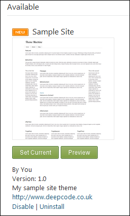
Open the orchard dashboard and navigate to “Themes”. What you should find now is you have a new theme available;

image

Click set current and navigate back to your site and voila, you should have your new theme in all it’s glory;

image

Fill it with some standard content
Go ahead and add some content to your site – add an about page (and add it to the menu), a blog (and a couple of posts) and use the HTML widget to add some content to the various zones on the homepage (there is a widget layer specifically for the homepage) – maybe add content as placeholders for the twitter feed we will add to the homepage and add a recent blog post widget to the central tri panel zone. You should then have something like this;

image

Next
In the next post, I’ll look at building the twitter widget for the homepage.

Tuesday, 10 May 2011

Real world Orchard CMS – introduction.

So, I’ve been a bit quiet here recently, mainly because I’ve been absolutely swamped with a re-architecture project for a pretty major client, but any free time I did have I’ve been using it to learn about Orchard CMS. As you, yes you, you’re the only person that reads my blog… as you may know, I’ve had my own CMS for a number of years (http://www.fluxcms.co.uk or http://flux.codeplex.com), but with pressure of work I’ve not had much time to update it or add new features and to be honest, now that Orchard has released v1.1, I really don’t see much point in taking flux forward – Orchard kicks it’s ass to the ground and stomps on it’s private bits.

What is Orchard – it’s and ASP.NET MVC content management system, backed by Microsoft and is Open Source!
If you haven’t heard of Orchard, I strongly encourage you to go look at it now – http://www.orchardproject.net or http://orchard.codeplex.com – it’s well designed and uses some great technology like ASP.NET MVC3, the new Razor view engine, NHibernate for persistence, AutoFac for DI/IOC and it’s got a nice, active and helpful community. The key people on the project are Microsoft employees and MS have kindly funded the project up to this point, and presumably will continue to do so in the future, but there is a reasonably vibrant, and growing, community around the product.

Learning Orchard
Anyway, I needed to build a site for a friend of mine who is shortly launching a set of premium SharePoint components and solutions and for this he needed a website to promote and sell his wares, I volunteered to help out as his requirement would touch on most areas of Orchard and gave me a good reason to dive in with a real world example that I could then reskin and make open source for the basis for this series.

Learning orchard was quite straight forward, the source is available and there is some good documentation on the site – the recent release of v1.1 was also a godsend (take a look at the new shape tracing features to see why). What I did find though was as I started to go beyond the basics of modules and skins, the documentation was a little light, but the community made up for this, with regular and prompt answers to questions and some good overall advice. (big up to bertrandleroy and randompete on the forums for all their patience and help!).

I hope that this series will help other newcomers to adopt this CMS and grow the community further.

Scope
And so, without further ado, the scope of the site is for a fictitious company that makes premium components, themes and modules for orchard. They require a site which features;

  • Nice(ish) site design
  • Homepage layout with
    • an aggregation of recent content, both from the site and from external sources (eg: Twitter)
    • a promotion area to have the most recent product promoted
  • Blog to post articles, tips and announcements for the products
  • Rudimentary general pages
  • A list of products they sell
  • Product sections – each product will feature;
    • Separate pages for main product overview, features etc.
    • Ability for users to rate products and enter reviews
    • Screenshot library for each product
  • Basic shopping functionality
    • On any of the product pages, add the product to the basket
    • Products may be pre-release and so instead offer a “register your interest” option.
    • Shopping cart view
    • Check out via swreg.com or similar.

All in all, this is a pretty simple site but touches on all the key areas of development with Orchard. The look and feel of the site is as per the following mock up (click for a larger view);

orchard-kitbag-screenshot

Up next
So that’s the stage set, up next we’ll get ourselves a copy of orchard and make a start on skinning it to look like the above. I’m not planning on covering how to use orchard to manage your site in any of these posts by the way, this will purely be technical content which I’m hoping to write in a recipe style so you can both follow along with the series or use each article as a reference for how to achieve a particular goal.